Careers
Eye-catching infographics, punchy messaging, and clear language are just three ways to grab people’s attention. Laura West, Senior Scientific Excellence Coordinator of R&D Biopharm Discovery at GSK, explains how to make your scientific research more visually attractive.
When it comes to displaying your scientific work, the experiments and data could be your best, but getting the visibility your work deserves and engaging your target audience require careful thought. It is, therefore, vital to be to think about how you communicate, not just what you communicate.
Every day, we are inundated with information. It’s more important now than ever to grab the attention of your audience, while improving the way you communicate. This helps people retain information about the data and key messages you deliver.
Ask yourself: what is the key message I want people to take away from this piece of work? You can then start to build around that.
When it comes to the overall layout of your work, you need to think about visual hierarchy, which is the arrangement of the elements on the page. This tells readers what to focus on depending on its importance.
It’s also worth thinking about how people best consume their media. Infographics, data visualisation graphs, images, and short videos are all great ways to attract and hold people’s attention.
Here are five ways to boost engagement in your work today.
1. Start with a bold, catchy message
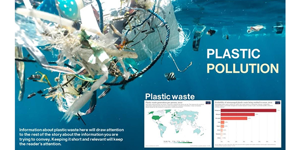
Image from Naja Bertolt Jensen, Data: Plastic Pollution - Our World in Data. Graphic from Laura West
A clear, simple message that is big, bright, bold and catchy will grab people’s attention. Take a look at the infographic below. Notice how your eyes are immediately drawn to ‘Plastic Pollution’, which is short, punchy, and immediately noticeable.
2. Pick relevant images

65% of people recall information for up to three days when it is paired with a relevant image. So, pick relatable images to make your work more memorable.
3. Keep it simple
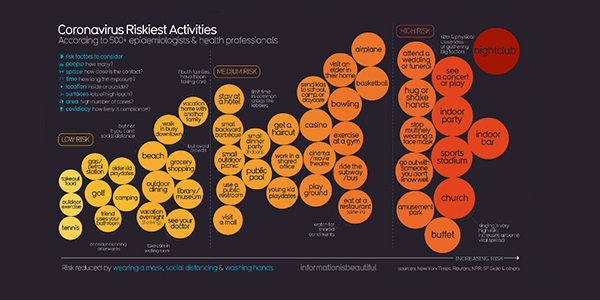
Covid 19 Infographic Datapack from Information is Beautiful.
Aim to keep your sentences short and use simplified language. This approach will make your work more accessible and easier to understand, and it will help your audience retain information.
Second, if you have a large amount of data, consider how to display it so that people can immediately follow what you’re showing them.
Take a look at the ‘Coronavirus Riskiest Activities’ infographic below. You can immediately see that ‘nightclub’ is the riskiest activity from the huge amount of information on the page. Note the use of negative space (or empty space) on the page to intensify the size of each bubble.
4. Use colour and contrast
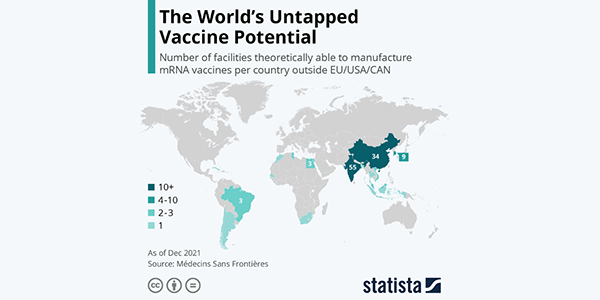
This infographic from Statista uses a simple colour scale to clearly demonstrate the data.
Colour choice matters. Our eyes pick up the contrast between certain colours and using this to your advantage will help accentuate the importance of certain items on the page. Think about the contrast between the colours you are displaying to make the text or imagery striking. This helps readers associate patterns or trends quickly.
In the image above, for example, it is easy to identify the teal colours against the white background and grey world map and immediately identify the countries.
5. Think about how people read
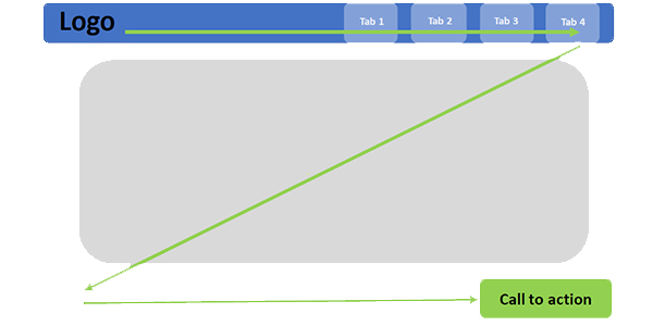
Readers use a 'Z' pattern to visually skim content.
Studies show that when we ingest digital information, we first scan the page in a ‘Z’ or ‘F’ pattern to determine whether it is worth reading.
If the information is predominantly text heavy, we read by scanning the left side of the page as this contains left aligned headings and bullet points. When reading information that is not in text-heavy paragraphs, we tend to read in the more ‘Z’ aligned format (left to right and top to bottom).
When thinking about the type of work you are displaying, consider where you want your most important information on the page.
27 September 2022 |
|


 |
|